z/TPF, TCP/IP trace, Wireshark, and R
Abstract
Using R to detect and display TCP/IP connections with suspicious anomalies based on pcap data pre-processed by Wireshark.
Target Audience
Although written from the perspective of an IBM Z-series communications specialist, I hope this article might be of some assistance to anyone who needs to perform bulk analysis of TCP/IP traffic, and introduces the use of the Wireshark application used in conjunction with the R programming language for that purpose. Wireshark configuration and R code is made available for the analysis and fully explained in the form of a basic tutorial so that no more than basic Wireshark and R experience is required.
Introduction
As a communications specialist working on a large z/TPF installation, a lot of my time is taken up with the detailed analysis of specific data exchanges. Whilst the IPTPRP utility provided by IBM exposes very slightly more information, I suspect that most people have, like me, long ago moved over to using Wireshark on a day-to-day basis as its field extraction, protocol analysis, and colouring rules reveal much more of what’s going on, and make me considerably more productive.
What is, perhaps, less well known, is how to combine Wireshark and subsequent post-processing to render bulk dataflows graphically for ease of communication with our business partners involved in the problem analysis of outages and slowdowns (after all they have pretty dashboards to easily drill down on their servers and network nodes which render the results instantly and graphically which we mostly lack!). But we can, at least in part, successfully address this imbalance and improve our discovery and knowledge-sharing.
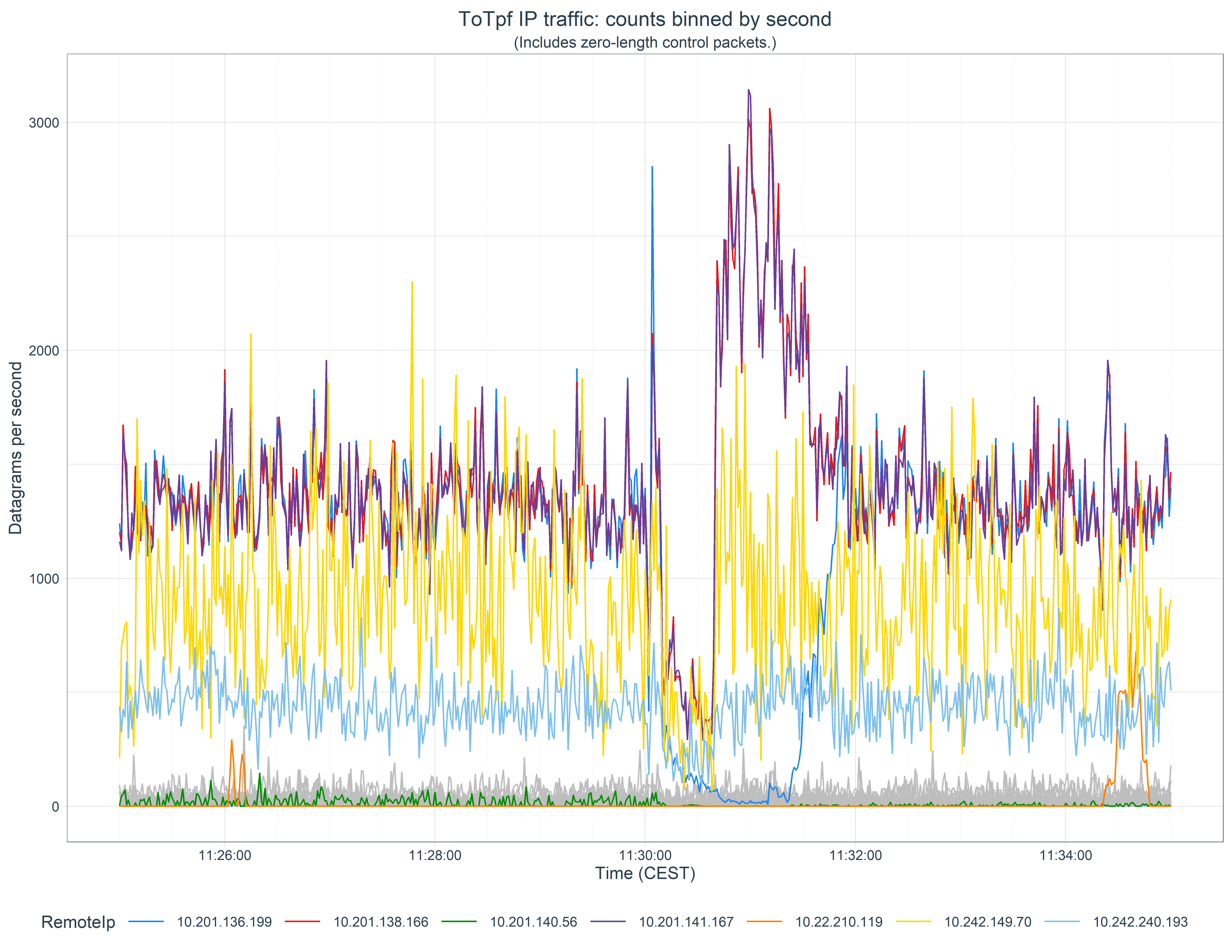
Here we’ll look at a real-life example of the analysis of a brief interruption to a number of systems where we want to know which systems where was affected so we can focus the investigation on commonalities. We’ll produce the following graph to help with this:
Summary of steps
The procedure here is not onerous. It consists of:
Getting a PCAP-format file
Running this though the Wireshark protocol analyser and exporting the results as a CSV-format file
Reading this into our post-processing script
Perform some initial processing and bin the data by timestamp
Identify which IP addresses might be affected
Deal with missing data
Finally plot the data
Getting a PCAP file
You almost certainly know how to do this, but in the spirit of writing a soup-to-nuts guide, we’ll start here. If, like I, you have a capture dataset from a z/TPF system, then you would run the offline IPTPRT utility on z/OS to post-process the data capture and specify the time interval you’re interested in. Something like this:
//JOBLIB   DD DISP=SHR,DSN=ZTPF.LINKLIB
//*
//IPTPRT   EXEC PGM=IPTPRT,
// PARM='PCAPFILE TIME 11:25:00 11:35:00'
//*
//IPTR     DD DSN=RTI.TAPE,DISP=SHR,UNIT=3490,VOL=SER=G08308
//*
//SYSPRINT DD SYSOUT=*
//SYSERR   DD SYSOUT=*
//*
//PCAPFN   DD PATHOPTS=(OCREAT,ORDWR,OTRUNC),
// PATHMODE=(SIRWXU,SIRWXG,SIROTH,SIXOTH),
// FILEDATA='BINARY',
// PATH='/path/G08308-1125-1135-all.pcap'
Download the output from this to your desktop machine in binary. (I’m using Windows for this work but all the tools I describe here also (purportedly!) work on both Linux and Mac desktop environments.)
If you’re coming from a platform other than z/TPF then you’ll need to do something else to get a pcap capture.
These captures can be quite big, so you may wish to compress the file if, like I, you keep an archive of your problem captures for future use. Wireshark can read Gzipped files directly so that’s a good target format to choose. (On Windows, 7-Zip can generate a gz file. Wireshark can’t read any other zipped format though.)
Analysis and conversion with Wireshark
Whilst it is possible to read pcap files directly in our subsequent post-processing analysis and presentation steps, we would then be forced to code (test, debug, support, …) all the protocol analysis ourselves. We choose instead to leverage the talents of the myriad of developers who have already coded and verified this in the open-source Wireshark project. (Protocol analysis is constantly being worked upon and you may wish to examine the bleeding edge development version for recent work.)
It is important that your Wireshark configuration is set up to display all the fields you wish to use in your subsequent analysis. More than you need will make the intermediary file larger, but too few could necessitate reconversion of the capture file. Note that the name of each column will become the default name of the data field once read in, so setting that up as you wish now can save you some extra work in future.
The configuration I’m currently using is:
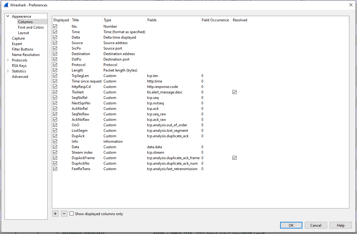
(If you are unsure how to set up new display columns, Chris Greer has an excellent video on this, and other Wireshark basic setup, at www.youtube.com/watch?v=OU-A2EmVrKQ.)
Open your pcap file and allow Wireshark to import and analyse it. This can take several minutes if your file contains a lot a data. A fast processor and lots of RAM will help this and the following steps.
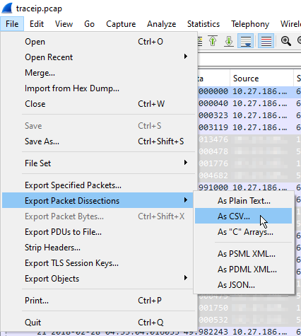
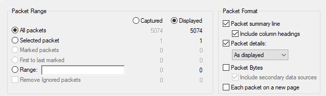
Once imported, you can immediately export the analysis as a CSV file. This is performed via File -> Export Packet Dissections -> As CSV… . Select all packets and let it run. This too can take several minutes. The export file will be several times larger than the (uncompressed) pcap file, but this will, of course, vary by which fields you have chosen to export.
Analysis and presentation with R
If you come from the same IBM mainframe background as I do, you may be used to performing your ad-hoc analyses in languages such as Rexx, CMS Pipelines, and/or SAS. Other languages, however, such as R and Python, offer far greater richness of built-in data structures, and a wealth of free, open-source, libraries with which to process and present them. R in particular is designed specifically for vectorised processing, statistical analysis, and graphical presentation and, whilst admittedly somewhat quirky and occasionally even annoying and frustrating, has become my go-to language for this type of work (and for many others too: The CRAN Package Repository currently hosts over 18 000 packages and 39 task specialisations.)). I tend to work within the RStudio environment, a full description of which is out of scope here. (If you’re interested in knowing more, you can find a comprehensive getting started guide at education.rstudio.com/learn/beginner/. Likewise, a full description of R is also too big for here, but you can find out more at Hadley Wickham’s R for Data Science site.)
The objective here, as we stated above, is to look at which systems might have been impacted by a suspected link outage. We’ll do this by looking at the traffic on IP Address pairs, both to and from our z/TPF system. Some may be secondary victims, of course, but this is a good first pass.
Setup
Like all languages and IDEs, R needs some prolog. It’s a bit boring, but must be done, so please bear with me.
I like to work in markdown files (called Rmarkdown in the RStudio IDE) which allow me to retain the output of steps within a program source notebook.
Packages for the R environment are automatically downloaded and installed from the CRAN online repository using the install.packages() function, then made available to the global namespace via the library() function. The former needs running only once; the later every time you start a new R session. However, when you install a new major level of R, you will need to download a fresh copy of all the packages you use from CRAN. In order to make this as painless as possible I keep all my install.packages() calls within an FALSE if-then clause. For this example, you’ll need to install the following packages:
install.packages("glue")
install.packages("readr")
install.packages("dplyr")
install.packages("lubridate")
install.packages("ggplot2")
install.packages("plotly")
install.packages("tidyr")
install.packages("tidyquant")
You’ll now need to make some of these available to the global namespace using the following:
library(glue)
library(readr)
library(dplyr)
library(lubridate)
library(ggplot2)
library(plotly)
Finally, we set a global option to give us better precision in time calculations:
options(digits.secs=6)Read the CSV
Finally, we get to the meat of the matter. Readr is a package on CRAN which contains functions for reading various types of data files, amongst them CSVs. We define a function to read all the columns we export from Wireshark, retain the column names, and convert certain numeric fields to integers. (It seems to have some problems with long integers, such as those used in the TCP sequence number fields, so we leave those as characters for now, and convert them manually later.):
rdCsv = function(csvFn, maxLines=Inf) {
  readr::read_csv( csvFn,
                   col_names=TRUE,
                   n_max = maxLines,
                   col_types = cols( .default = "c",
                                     `No.` = "i",
                                     Time = "c",
                                     Delta = "d",
                                     SrcPo = "i",
                                     DstPo = "i",
                                     Length = "i",
                                     TcpSegLen = "i",
                                     httpRespCd = "i",
                                     SeqNoRel = "c",
                                     NextSqnNo = "c",
                                     AckNoRel = "c",
                                     SeqNoRaw = "c",
                                     AckNoRaw = "c"
                                     )
                   )
}
Now we just specify the filename and call the function to do the reading. Like many languages, R treats the backslashes we use in Windows paths as special characters, so we either have to double those up, or use raw strings, specified like:
r"(this\path)"R also lacks an easy way to concatenate strings. The best option is probably to use the glue() function (from the CRAN glue package) to concatenate “strings” and {variables}, for instance:
captureDate <- "20220810"
captureCsvFn <- "G08308-1125-1135-all"

pcapFile <- glue( r"(E:\iptraces\{captureDate}\{captureCsvFn}.csv)" )
With that done we call our function to read the file and pipe the output into a mutate() function (from the dplyr package) to correctly convert those sequence numbers that the csv reader couldn’t handle. Whilst we’re there, we also convert the flags Wireshark uses for its indicators to a simple TRUE value:
pcapData <-
  rdCsv( pcapFile, Inf ) %>%
  #
  # read_csv has issues with these fields
  #
  mutate( SeqNoRel = as.numeric(SeqNoRel),
          NextSqnNo = as.numeric(NextSqnNo),
          AckNoRel = as.numeric(AckNoRel),
          SeqNoRaw = as.numeric(SeqNoRaw),
          AckNoRaw = as.numeric(AckNoRaw),
          ) %>%
  #
  # Change flag character to TRUE, but leave false as NA for easier eyeballing
  #
  mutate( OoO         = if_else(is.na(OoO),         NA, TRUE),
          LostSegm    = if_else(is.na(LostSegm),    NA, TRUE),
          DupAck      = if_else(is.na(DupAck),      NA, TRUE),
          FastReTrans = if_else(is.na(FastReTrans), NA, TRUE)
          )
Initial processing and time-sequence binning
We’re now ready to process the data. We’ll be using here mainly the dplyr functions mutate(), which we’ve just seen used to change the contents of a field, as well as select() to select the data fields we wish to output, and filter() to filter the output by values.
First, we need to define which local IPs we have on our system:
locIps = c( "10.27.187.1",
            "10.27.186.10",  "10.27.186.42",  "10.27.186.74",  "10.27.186.106",
            "10.27.144.101", "10.27.144.161", "10.27.144.131"
            )
Then we can take the data we’ve just read and do the following to each packet:
- Mark the direction as being either “ToTpf” or “FromTpf”
- Create a new field to copy the Remote IP address into
- Do the same for the Local TCP port
- And the Remote TCP port
- Convert the timestamp from character format to POSIXlt format
- Bin each datagram into a 1 second wide bin by timestamp (We’re content to use the starting edge of the bin as the label here, but different times can be specified if desired, which can be useful for wider bins.)
csvDataProcessed <-
  pcapData %>%
  #
  mutate( ToTpf = if_else( Destination %in% locIps, TRUE, FALSE ) ) %>%
  mutate( Direction  = if_else( ToTpf, "ToTpf", "FromTpf" ) ) %>%
  mutate( RemoteIp   = if_else( ToTpf, Source, Destination ) ) %>%
  mutate( TpfPort    = if_else( ToTpf, DstPo, SrcPo ) ) %>%
  mutate( RemotePort = if_else( ToTpf, SrcPo, DstPo ) ) %>%
  #
  mutate( TimeLt  = strptime(Time, "%Y-%m-%d %H:%M:%OS", tz="") ) %>%
  mutate( timeBin = cut(TimeLt, breaks="1 sec") )
In order to graph the volume, we need to know the number of datagrams for each time bin, for each remote IP address, for each direction. This is done elegantly in R by first grouping the data by those fields, then calling the summarise() function with a function to run on that group as its argument. Here we just want to count the data, so we’ll just call n(), but we’ll see a more interesting application of this in a moment. Whilst we’re here, we’ll also convert the binned time variable to POSIXct format, which we’ll see our plotting function demand in a moment:
timeBinnedCounts <-
  csvDataProcessed %>%
  group_by( timeBin, RemoteIp, Direction ) %>%
  summarise( count = n() ) %>%
  mutate( Time = as.POSIXct(strptime(timeBin, "%Y-%m-%d %H:%M:%OS", tz="")) ) %>%
  ungroup()
Identifying abnormalities
We now have the data we want to plot, and it’s ready for plotting. The problem is that it contains so many Remote IP address that it’s difficult to see the wood for the trees. So here we’re going to identify which Remote IPs are suspicious, and which we think are unaffected. The suspicious ones we’ll highlight, the others we’ll plot in gray to provide context to our business partners.
How we choose which ones to filter is somewhat experimental. For this data we decided to calculate the maximum, minimum, mean, and standard deviation values for each Remote IP address and highlight those where the maximum or minimums exceed the mean ± 2 SDs, given they had some high maximum values. We do this the same as before, using summarise() within a group_by(), then setting a hilight boolean.
We also have a couple of IP addresses our business partners have already identified as potentially affected, so we want to force those to be hilighted regardless of the results of our calculations.
ForceHilightIpList <- c("10.201.136.199", "10.201.140.56")
DirectionOfInterest <- "ToTpf"

analyseCounts <-
  timeBinnedCounts %>%
  filter( Direction == DirectionOfInterest ) %>%
  #
  group_by(RemoteIp) %>%
    summarise( n = n(),
               max = max(count),
               min = min(count),
               mean = mean(count),
               sd = sd(count)
               ) %>%
  ungroup() %>%
  #
  mutate( highLimit = mean + 2 * sd,
          lowLimit = mean - 2 * sd
          ) %>%
  mutate( hilight = ((max > highLimit) | (min < lowLimit) | (max > 600)) & (max > 500) ) %>%
  mutate( hilight = if_else( RemoteIp %in% ForceHilightIpList, TRUE, hilight) )
Of this, we’re going to need just the Remote IP address and highlight booleans in a moment, so select those:
IpHilights <-
  analyseCounts %>%
  select( c(RemoteIp, hilight) )
Deal with missing data
We also have one more thing we need to deal with before we can plot the data. In the case where there are no datagrams transferred during a time bin we have no data, which will confuse the plotting library. So we want to add zeros for all those. We can do this easily using the complete() function from the tidyr package. As we haven’t added tidyr to the global workspace (by using a library call for it), we can just prefix the complete() call with the package name. Also, we no longer need the timeBin field so we remove it to keep things tidy:
timeBinnedCountsCompleted <-
  timeBinnedCounts %>%
  tidyr::complete( Time, RemoteIp, Direction, fill=list(count=0) ) %>%
  select( -timeBin )
Now we can combine our hilight booleans for the selected IP addresses with this data by performing a left join:
filteredTimeBinnedCounts <-
  timeBinnedCountsCompleted %>%
  filter( Direction == DirectionOfInterest ) %>%
  left_join( IpHilights )
Plot the data
And now we really can plot our data. First we set up a custom color palette we use in all our work so there’s consistency between our graphics. I find the following works reasonably well for qualitative, categorical variables such as we’ll be using here:
c25 <- c(
  "dodgerblue2",
  "#E31A1C", # red
  "green4",
  "#6A3D9A", # purple
  "#FF7F00", # orange
  "black",
  "gold1",
  "skyblue2", "#FB9A99", # lt pink
  "palegreen2",
  "#CAB2D6", # lt purple
  "#FDBF6F", # lt orange
  "gray70", "khaki2",
  "maroon", "orchid1", "deeppink1", "blue1", "steelblue4",
  "darkturquoise", "green1", "yellow4", "yellow3",
  "darkorange4", "brown"
)
We start by declaring the data we wish to plot and tell ggplot() to use the Time field as the x axis, and we will want to draw each RemoteIp as a single line:
plot <-
  ggplot(filteredTimeBinnedCounts ,
          aes( x=Time,
               group = RemoteIp,
               )
          ) +
Then we tell it to select from the data only those samples that are not highlighted, use the Count field as the y axis, and plot all those lines in grey:
    geom_line( data = filteredTimeBinnedCounts %>% filter(!hilight),
               aes( y = count,
                    ),
               color = "grey"
               ) +
We now deal similarly with all the lines we want highlighted, but map each line to a different color by declaring it inside the aes() call:
    geom_line( data = filteredTimeBinnedCounts %>% filter(hilight),
               aes( y = count,
                    color = RemoteIp
                    ),
               )  +
And now all the rest is just tinkering. We declare how we want the x axis to be formatted, and where minor breaks should occur:
    scale_x_datetime( date_labels = "%H:%M:%S",
                      date_minor_breaks = "30 sec"
                      ) +
I like to use a standard theme from the tidyquant package but make some changes to the presentation of some of the elements:
    tidyquant::theme_tq() +
    theme( plot.title = element_text(hjust=0.5),
           plot.subtitle = element_text(hjust=0.5),
           legend.key.width = unit(1, 'cm'),
           panel.grid.minor.x = ggplot2::element_line(color = "grey80", size = ggplot2::rel(1/6), linetype="dashed"),
           ) +
Set the number of columns in the legend, the color palette for the lines, and finally the textual elements:
    guides(col = guide_legend(ncol = 8)) +
    scale_color_manual( values = c25) ) +
    labs( title = glue("{DirectionOfInterest} IP traffic: counts binned by second"),
          subtitle = glue("(Includes zero-length control packets.)"),
          x = "Time (CEST)",
          y = "Datagrams per second"
          )
Now we have three options available to view the plot. To display it directly in RStudio, we can simply display the variable name containing the result:
plotIf we wish to interactively explore the graph, zooming in on certain areas, we can use the plotly package:
ggplotly(plot)And, finally, to save a high definition PNG of the graph, we can define a function, and call that:
savePlot <- function(plot, fnPrefix) {
  generationTime = now()
  ymdhmsz = format(as.POSIXct(generationTime), format = "%Y%m%d %H%M%S %Z")

  plotFn = glue("{fnPrefix} {ymdhmsz}.png")

  ggsave(
    file.path("output", plotFn),
    plot = plot,
    width = 11,
    height = 8.5,
    units = "in",
    dpi = 600
  )
}

savePlot( plot, glue("2022-10-08 {DirectionOfInterest} Second-binned counts") )
Summary
We have seen in this article how we might use the Wireshark application in conjunction with the R programming language to convert and analyse large volumes of IP trace traffic captured on an IBM z/TPF, or other, system, particularly one without an interactive IP trace explorer dashboard, and present that in a fashion that is easy to share our problem investigations graphically with our business partners, but also quick to reprogram to extract specific information that they may request.
Thanks
This article is based on work performed for SNCF, and is published with their permission, for which many thanks.