Notes on MADness
Abstract
Target Audience
Introduction
One of my responsibilities as a z/TPF mainframe communications SME is the post-mortem investigation of network failures. Due to careful design, and a high degree of professionalism over many years, these are few in number, and almost always brief in duration but, as a large, government-owned, international transport provider, any outage that affects reservations, ticketing, or departures (especially one that leads to a concomitant snowballing of delays across the transport network) leads to an erosion of public confidence, and the potential for adverse publicity in mass and social media. For don’t we all like to take any opportunity to stick it to the gov’ment?
Additionally, as is usual in any large enterprise with multiple contracted-out service providers, there are multiple entities responsible for the payment of penalties in such an event. Thus, after any communications outage, we have to verify, and be able to prove, that our own system was not the root cause. We are also, as a centralised processing platform with detailed logging, in a unique position to able to examine all of the traffic flow before, during, and after an event, and thus guide the network team in identifying any commonality in the distribution of affected resources.
There are several challenges that we have to deal with here which make this type of investigation of general interest.
The first is the identification of those connections that were affected by the incident. If we were to examine all possible connections manually we would be forced to look at over 600 charts which, even with the best will in the world, is going to be highly error prone. So we need to find some way of detecting outliers indicative of circuit disruption. Automated outlier detection seems to be problematic even for the most dedicated data scientists, so I’ll settle for a simple way of reducing the number of circuits that we’ll submit to human analysis. After all, we’re not trying to build a self-driving car here.
We need some way of presenting the data in a way that can be dynamically filtered and sorted during the human analysis phase, and then presented to our network team to aid in focussing their investigations.
Finally we need to consider the sheer volume of data. At the time of the incident that was the inspiration for this article, which was not the peak time of day, we were logging in excess of 11,000 datagrams per second: a 40 minute capture contained over 27 million datagrams. Dealing with this volume of data on a standard office-issue pc presents some challenges, which we shall discuss.
Detection of impacted connections
What we’re attempting to do here is categorise the expected traffic flow volumes and identify any moments at which the actual traffic volumes are outside of the expected limits. Such outlier detection seems tricky, at least on rather spiky tcp/ip traffic flows, and the recommendation from the data science community seems to be that we should simply flag potential outliers for human examination, accept a reasonable level of false positives but take care not to have false negatives.
We’re fortunate here that we enter this process knowing the rough time of an incident. This we can hone using existing application server throughput display. We then form a time window for our outlier search of +/- 5 minutes from the start of this window.
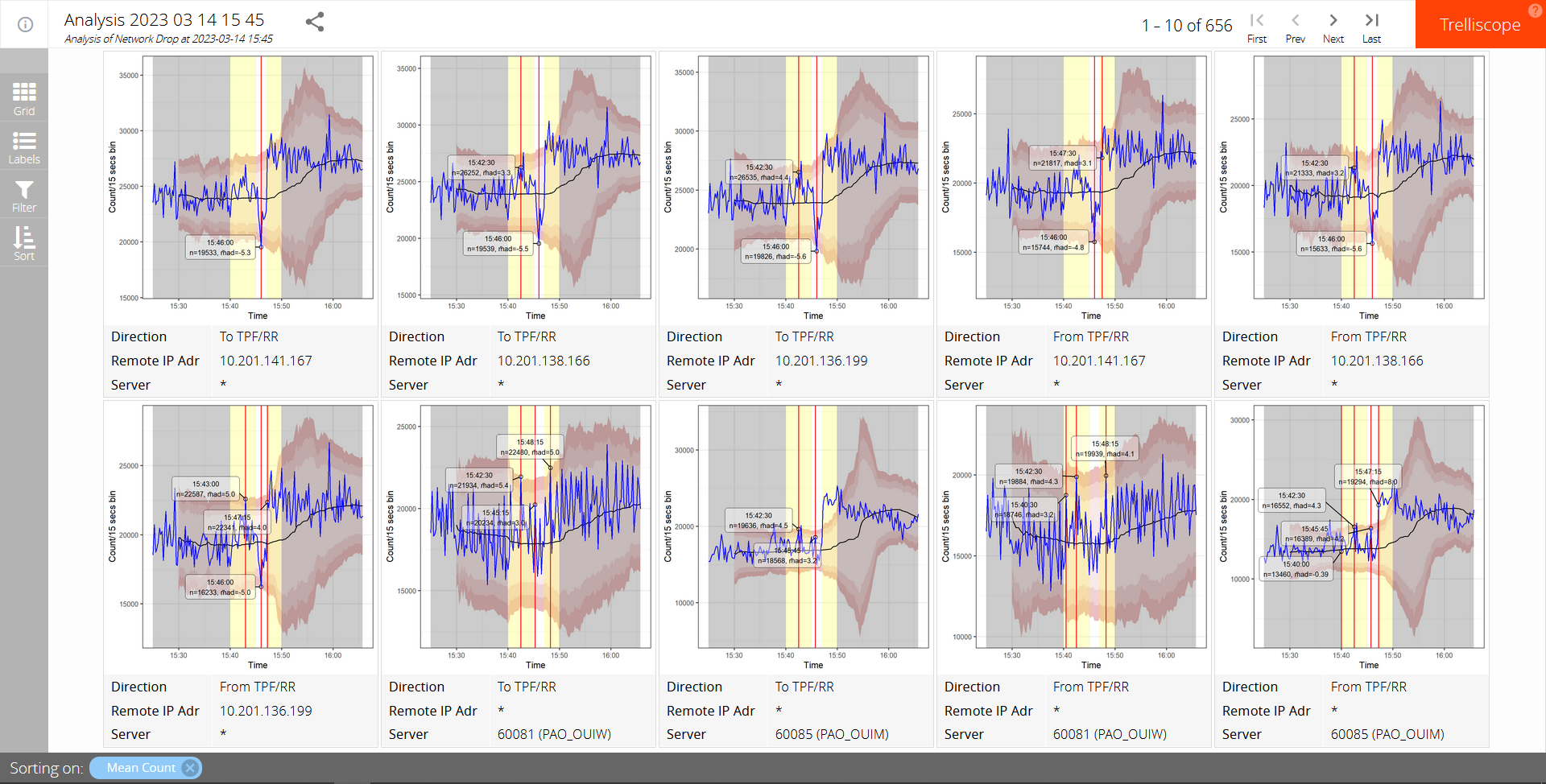
We use the following naïve method of outlier detection: We start our data analysis from 20 minutes before the start of this window to give us a baseline. We first bin the data into 15 second intervals, in an attempt to average the data a little without losing too much resolution. From that we then calculate the median volume in a sliding window that starts when we have 20 samples (5 minutes) and increases steadily to a maximum of 60 (15 minutes). We then calculate the median absolute deviation from that median value (M̃AD), using the same sliding window sizes. Volume counts that occasionally exceed three median absolute deviations are not uncommon but if we have at least two of them within any 5 sample interval, within the outlier search windows, then we will flag them for further investigation.
Should any single count exceed 5 M̃ADs, again within that same window, then that alone will cause it be flagged.
I very much doubt that this process would work well without further refinement for full-automated alerting, but for our purposes we’ll see that, when combined with some other techniques, it reduces the initial number of volume flow charts requiring human analysis from over 600 to around 20. Good enough.
Presentation of results
“At the heart of quantitative reasoning is a single question: Compared to what? Small multiple designs, multivariate and data bountiful, answer directly by visually enforcing comparisons of changes, of the differences among objects, of the scope of alternatives. For a wide range of problems in data presentation, small multiples are the best design solution.” – Tufte, Edward (1990). Envisioning Information
The next challenge we face is how to present our data for rapid human analysis. We would like to be able to display multiple charts of traffic flow, filtered by such things as IP address, TCP port, direction, data volumes, dispersion, and the presence of detected outliers, sorted by any of these. And, really, we would like to do this dynamically and interactivly.
There are plenty of tools which enable us to produce static small multiples, but few that are dynamic and interactive. Of those we have chosen trelliscope which runs in web browser, allowing us to simply send a zipped data folder to anyone who wishes to view our results.
Thanks
This article was inspired by work performed for SNCF, and is published with their permission, for which many thanks.